Media
Images used throughout the Design Language should adhere to the following types of imagery; black and white pet imagery, article photography pack shots and user or pet avatars. Pet of pack imagery should not be used if the animal or pack is not legible.
Background image
A basic background image using a figure element for improved semantics. The image is centerally positioned, doesn't allow cropping and doesn't repeat.
<figure class="rc-bg-image" style="background-image: url('/assets/images/img-b-w.jpg');">
  <figcaption class="rc-screen-reader-text">Text about image</figcaption>
</figure>Copied!
<div class="rc-bg-responsive-image__wrapper">
  <picture class="rc-bg-responsive-image rc-bg-responsive-image--contain" role="presentation">
    <source srcset="/assets/images/responsive-backgrounds/Dachshund-2000px.jpg" media="(min-width: 1500px)" />
    <source srcset="/assets/images/responsive-backgrounds/Dachshund-1500px.jpg" media="(min-width: 600px)" />
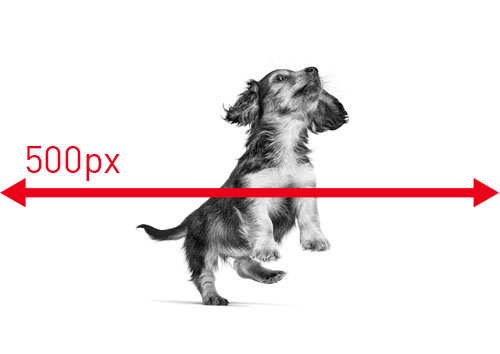
    <img src="/assets/images/responsive-backgrounds/Dachshund-500px.jpg" alt="A Dachshund jumping" />
  </picture>
</div>Copied!

<div class="rc-bg-responsive-image__wrapper">
  <picture class="rc-bg-responsive-image--cover" role="presentation">
    <source srcset="/assets/images/responsive-backgrounds/Dachshund-2000px.jpg" media="(min-width: 1500px)" />
    <source srcset="/assets/images/responsive-backgrounds/Dachshund-1500px.jpg" media="(min-width: 600px)" />
    <img src="/assets/images/responsive-backgrounds/Dachshund-500px.jpg" alt="A Dachshund jumping" />
  </picture>
</div>Copied!
Background image position
You can define position of background image: top, bottom, left, right with .rc-bg-responsive-image--[direction]. Default position is center.

<div class="rc-bg-responsive-image__wrapper">
  <picture class="rc-bg-responsive-image--cover rc-bg-responsive-image--top" role="presentation">
    <source srcset="/assets/images/responsive-backgrounds/Dachshund-2000px.jpg" media="(min-width: 1500px)" />
    <source srcset="/assets/images/responsive-backgrounds/Dachshund-1500px.jpg" media="(min-width: 600px)" />
    <img src="/assets/images/responsive-backgrounds/Dachshund-500px.jpg" alt="A Dachshund jumping" />
  </picture>
</div>Copied!

<div class="rc-bg-responsive-image__wrapper">
  <picture class="rc-bg-responsive-image--cover rc-bg-responsive-image--bottom" role="presentation">
    <source srcset="/assets/images/responsive-backgrounds/Dachshund-2000px.jpg" media="(min-width: 1500px)" />
    <source srcset="/assets/images/responsive-backgrounds/Dachshund-1500px.jpg" media="(min-width: 600px)" />
    <img src="/assets/images/responsive-backgrounds/Dachshund-500px.jpg" alt="A Dachshund jumping" />
  </picture>
</div>Copied!

<div class="rc-bg-responsive-image__wrapper">
  <picture class="rc-bg-responsive-image--cover rc-bg-responsive-image--left" role="presentation">
    <source srcset="/assets/images/responsive-backgrounds/talk-to-us--lg.jpg" media="(min-width: 1500px)" />
    <source srcset="/assets/images/responsive-backgrounds/talk-to-us--lg.jpg" media="(min-width: 600px)" />
    <img src="/assets/images/responsive-backgrounds/talk-to-us--lg.jpg" alt="" />
  </picture>
</div>Copied!

<div class="rc-bg-responsive-image__wrapper">
  <picture class="rc-bg-responsive-image--cover rc-bg-responsive-image--right" role="presentation">
    <source srcset="/assets/images/responsive-backgrounds/talk-to-us--lg.jpg" media="(min-width: 1500px)" />
    <source srcset="/assets/images/responsive-backgrounds/talk-to-us--lg.jpg" media="(min-width: 600px)" />
    <img src="/assets/images/responsive-backgrounds/talk-to-us--lg.jpg" alt="" />
  </picture>
</div>Copied!
Background image - fill
The same as above but with the 'fill' modifier that allows cropping to ensure the whole parent container is filled.
<figure class="rc-bg-image rc-fill" style="background-image: url('/assets/images/img-b-w.jpg');">
  <figcaption class="rc-screen-reader-text">Text about image</figcaption>
</figure>Copied!
Background image - fixed ratio
Allows to set fixed ratio size to container. Two versions available - 16:9, 4:3.
<figure class="rc-bg-image rc-fixed-ratio" style="background-image: url('/assets/images/responsive-backgrounds/dashchund.jpg');">
  <figcaption class="rc-screen-reader-text">Text about image</figcaption>
</figure>Copied!
<figure class="rc-bg-image rc-fixed-ratio rc-fixed-ratio--4-3" style="background-image: url('/assets/images/responsive-backgrounds/schnauzer.jpg');">
  <figcaption class="rc-screen-reader-text">Text about image</figcaption>
</figure>Copied!
Background video
HTML 5 video element used as a background. Please ensure you include a poster image file for when the video is not avalible or the file format is not supported. There is also an extended version that blocks the video source from being loaded, checking the viewport size, then loading the best suited video source.
<div class="rc-bg-video__wrapper">
  <video class="" poster="https://i.vimeocdn.com/video/672704482_100x75.webp" playsinline="" autoplay="" muted="" loop="">
    WCAG general accessibility recommendation is that media such as background video play through only once. Loop turned on for the purposes of illustration; if removed, the end of the video will fade in the same way created by pressing the"Pause" button
    <source src="https://player.vimeo.com/external/247449130.sd.mp4?s=f85cb0d936e1febc64a48f3a7c50608ff7b708eb&profile_id=165" type="video/mp4" />
    <source src="https://player.vimeo.com/external/247449130.sd.mp4?s=f85cb0d936e1febc64a48f3a7c50608ff7b708eb&profile_id=165" type="video/webm" />
  </video>
</div>Copied!
<div class="rc-bg-video__wrapper">
  <video class="rc-bg-video-responsive" poster="https://i.vimeocdn.com/video/672704482.webp?mw=1700&mh=956" playsinline="" autoplay="" muted="" loop="" preload="none">
    WCAG general accessibility recommendation is that media such as background video play through only once. Loop turned on for the purposes of illustration; if removed, the end of the video will fade in the same way created by pressing the"Pause" button
    <source data-src="https://player.vimeo.com/external/247449130.sd.mp4?s=f85cb0d936e1febc64a48f3a7c50608ff7b708eb&profile_id=165" data-video-size="small" type="video/mp4" />
    <source data-src="https://player.vimeo.com/external/247449130.sd.mp4?s=f85cb0d936e1febc64a48f3a7c50608ff7b708eb&profile_id=165" data-video-size="small" type="video/webm" />
    <source data-src="https://player.vimeo.com/external/247449130.hd.mp4?s=fdba15e16be6ad9f3aafd19f5c1833bd5ab73bcc&profile_id=174" data-video-size="medium" type="video/mp4" />
    <source data-src="https://player.vimeo.com/external/247449130.hd.mp4?s=fdba15e16be6ad9f3aafd19f5c1833bd5ab73bcc&profile_id=174" data-video-size="medium" type="video/webm" />
    <source data-src="https://player.vimeo.com/external/247449130.hd.mp4?s=fdba15e16be6ad9f3aafd19f5c1833bd5ab73bcc&profile_id=175" data-video-size="large" type="video/mp4" />
    <source data-src="https://player.vimeo.com/external/247449130.hd.mp4?s=fdba15e16be6ad9f3aafd19f5c1833bd5ab73bcc&profile_id=175" data-video-size="large" type="video/webm" />
  </video>
</div>Copied!
Single Parallax image
Images can be added with a container and given data attributes to change their speed and other various settings. For more information visit here.

<div class="rc-parallax-wrapper">
  <img src="/assets/images/img-b-w.jpg" data-rellax-percentage="0.5" data-rellax-speed="-2" width="500" height="385" />
</div>Copied!

<div class="rc-parallax-wrapper">
  <picture class="" data-rellax-speed="-2" data-rellax-percentage="0.5">
    <source srcset="/assets/images/img-b-w.jpg" media="(min-width: 600px)" />
    <source srcset="/assets/images/img-b-w.jpg" media="(min-width: 800px)" />
    <img src="/assets/images/img-b-w.jpg" alt="A Dachshund jumping" />
  </picture>
</div>Copied!
Responsive Image
The HTML <picture> element serves as a container for zero or more <source> elements and one <img> element to provide versions of an image for different display device scenarios. The browser will consider each of the child <source> elements and select one corresponding to the best match found.
If no matches are found among the <source> elements, the file specified by the <img> element's src attribute is selected. The selected image is then presented in the space occupied by the <img> element.
To select the optimal image, the user agent examines each source's srcset, media, and type attributes to select a compatible image that best matches the current layout of the page, the characteristics of the display device, and so forth. Common use cases for this are to provide a HiDPI (Retina) version of an image when using a high-DPI display, and to offer fallback image formats when a modern format is not supported by an older browser. Picture Element by Mozilla Contributors is licensed under CC-BY-SA 2.5.

<picture class="">
  <source srcset="/assets/images/responsive-backgrounds/Dachshund-2000px.jpg" media="(min-width: 1500px)" />
  <source srcset="/assets/images/responsive-backgrounds/Dachshund-1500px.jpg" media="(min-width: 600px)" />
  <img src="/assets/images/responsive-backgrounds/Dachshund-500px.jpg" alt="A Dachshund jumping" />
</picture>Copied!
Responsive Image Hidden Below 600px
This example hides the image as resolutions lower than 600px by replacing it with a 1x1px transparent gif.

<picture class="">
  <source srcset="/assets/images/responsive-backgrounds/Dachshund-2000px.jpg" media="(min-width: 1500px)" />
  <source srcset="/assets/images/responsive-backgrounds/Dachshund-1500px.jpg" media="(min-width: 600px)" />
  <img src="/assets/images/responsive-backgrounds/1x1.gif" alt="Hidden image" />
</picture>Copied!

<picture class="">
  <source srcset="/assets/images/responsive-backgrounds/1x1.gif" media="(min-width: 1500px)" />
  <source srcset="/assets/images/responsive-backgrounds/Dachshund-1500px.jpg" media="(min-width: 600px)" />
  <img src="/assets/images/responsive-backgrounds/Dachshund-2000px.jpg" alt="Hidden image" />
</picture>Copied!
